[生活] How to build a monthly traffic of 100000 ➕ The independent beauty station? |

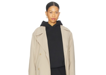 Fear of God ESSENTIALS Hoodie Review: Mi86 人气#fashion
 The Derby of San Francisco Style 300 Cha114 人气#fashion
 Why the Derby of San Francisco Classic S131 人气#fashion
 Romaoss Launches "Rebirth Plan," in Talk70 人气#tech
Complaint/Suggestion Contact
+email:3387918072@qq.com


Copyright © 2026 Gonglubian Copyright Powered by gonglubian 1.0


 WeChat
 douyin